Flyin' Illini Day
Make the ticket worth keeping.
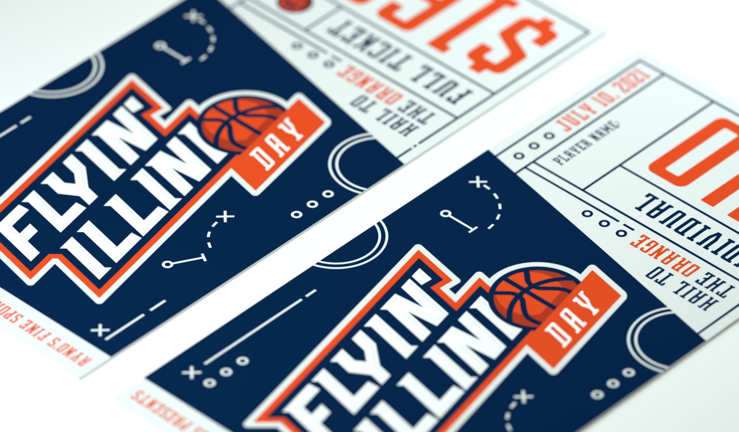
Ryno's Fine Sports Collectibles isn't a franchise. It's a small business built on genuine passion for the game, and a community relationship with University of Illinois players earned over the years. When Ryno decided to host five players for a signing event, he wanted the occasion to feel worthy of being remembered. The brief was simple: design a ticket worth keeping.
The logo needed to feel like it belonged on a jersey: bold, kinetic, and unmistakably Illinois. The typography leans forward, the basketball integrated into the letterforms rather than placed beside them. The background came together through exploration: shapes that quickly revealed themselves as basketball play diagrams, X's and O's, and movement lines that put the viewer on the court before they've read a single word. A conceptual choice that became the backbone of the ticket.
Client
Ryno's Fine Sports Collectibles
Year
2021
Project Details
Creative Direction
Art Direction
Graphic Design
Logo Design
3D Modeling


Full-day Ticket

Individual Player Ticket
Logo Concepts
Label Concepts
Label Concepts
Several directions were explored before the final font was locked in, one that carried the right weight without sacrificing legibility at small sizes. From there, the work was in the positioning: finding the exact place where the basketball stopped being an addition and became inseparable from the mark.
Two versions of the ticket were produced: one for attendees meeting a single player, one for those meeting all five. Same design system, scaled to the occasion. "Hail to the Orange" filled the remaining space not as an afterthought, but as the kind of detail a real fan would notice and appreciate. The whole thing was printed on heavy cardstock, because a ticket worth keeping should feel like it.
Ryno reported that the players were genuinely appreciative not just of the event, but of the effort behind it. Professional athletes recognized the craft that a small business had put into the occasion. That's the standard the work was held to.
The label design follows closely to the back cover. It carries over the nostalgic horror and American record label designs from the 1950s. A multitude of designs were created to try and encapsulate the design language we were trying to achieve.
The label design follows closely to the back cover. It carries over the nostalgic horror and American record label designs from the 1950s. A multitude of designs were created to try and encapsulate the design language we were trying to achieve.
The label design follows closely to the back cover. It carries over the nostalgic horror and American record label designs from the 1950s. A multitude of designs were created to try and encapsulate the design language we were trying to achieve.

Final Logo
© Jeremy Burns 2026