COVID Care Force
In a crisis, nothing is decorative.
In early 2020, Dr. Gary Morsch was flying home from China when the pandemic began to take shape. Before he landed, he had an idea. He'd built nonprofits before. He knew what needed to happen. COVID Care Force was conceived at 30,000 feet. An organization built to mobilize nurses to hard-hit, vulnerable communities and provide direct assistance on the ground. Starting with the Navajo Nation and partnering with Mother Teresa's organization, the Missionaries of Charity in Mexico, the goal of COVID Care Force was to reach some of the most vulnerable communities in the world.
A small Olathe, Kansas-based nonprofit with a clear mission and almost nothing else, no budget, no brand direction, and no time to waste. The identity needed to do the impossible: look credible enough to attract donors and partners, while signaling that not a dollar had been wasted getting there.
Dr. Morsch's focus was the work itself, getting nurses to the people who needed them. Branding wasn't his concern. That clarity of purpose was actually the brief.
I was handed the keys.
A pandemic is a moment of collective fear. The instinct for a healthcare nonprofit is to go clinical, credible, clean, trustworthy. I went a different direction.
There's something we tell children when the world feels scary: look for the helpers. That reframe became the entire design brief. This brand didn't need to reflect the dire nature of the moment. It needed to be something people could move toward. Bold. Action-oriented. A signal in the noise that said help is here.
The central design challenge wasn't aesthetic, it was strategic. How do you balance the weight of a global emergency with the warmth of community response? The answer was deliberate restraint.
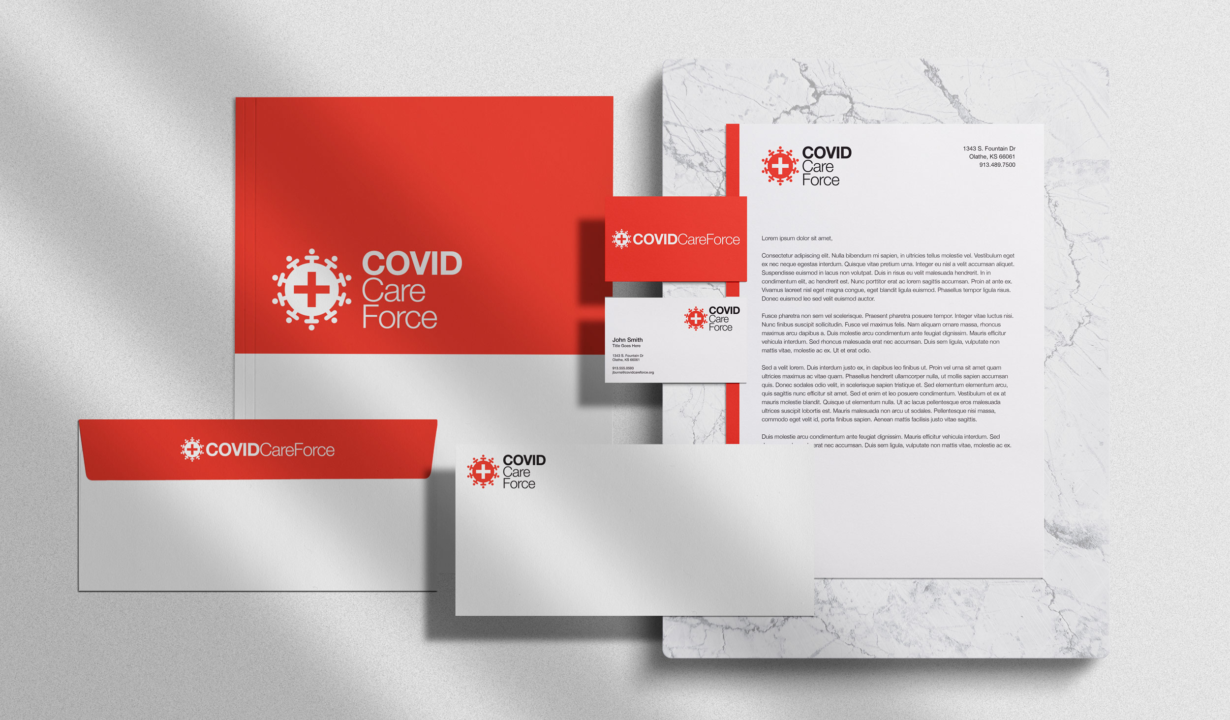
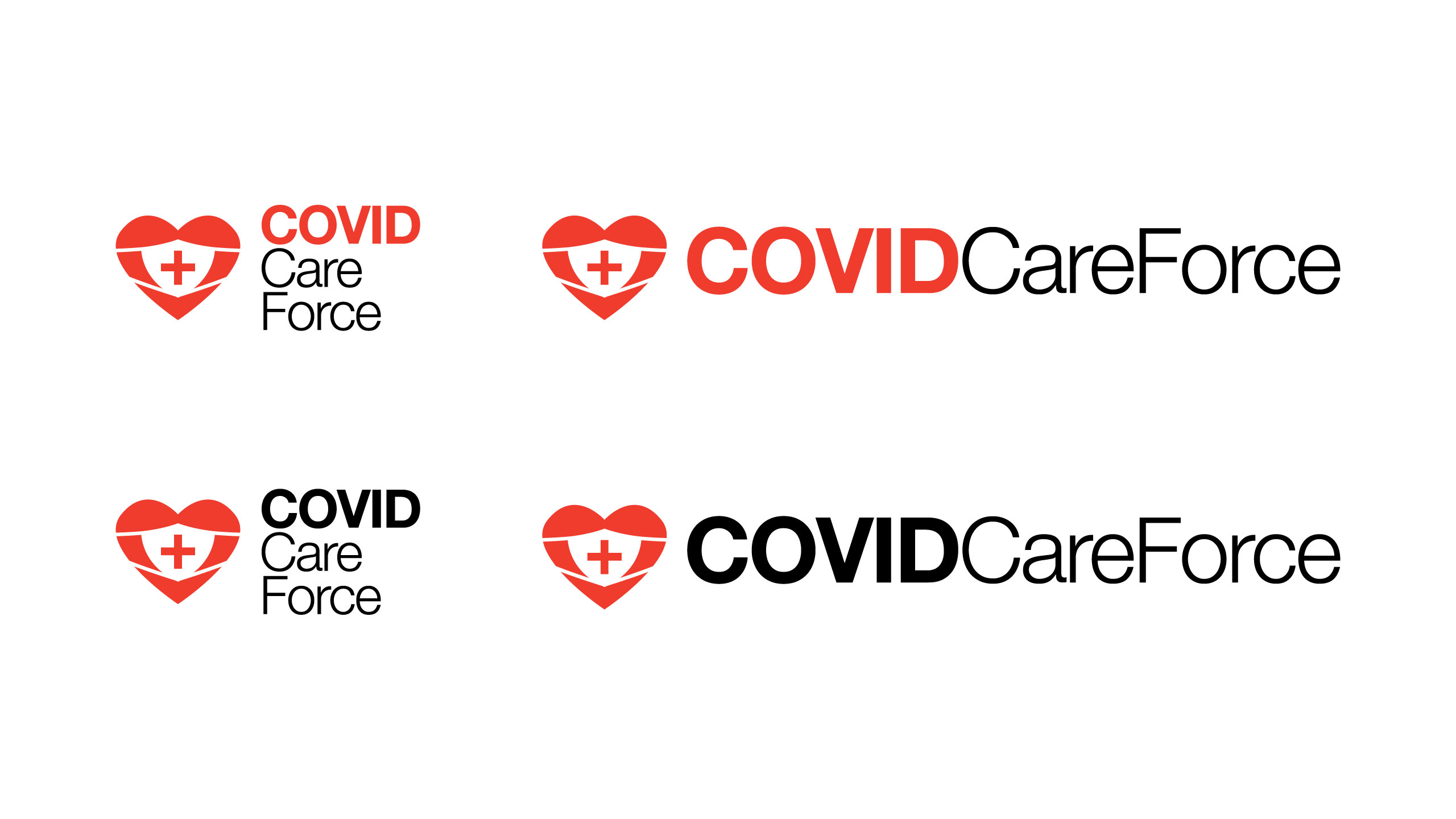
Red was chosen not despite its association with danger, but because of it. In a moment defined by urgency, a brand that softened that reality would have rung false. The mark unifies two defining realities of the moment, the visual language of the virus and the global reach of volunteer response, into a single, cohesive symbol. The typography was selected for the same reason: personality without ornamentation, clarity without coldness.
From that single insight, I built the brand from the ground up: logo, full identity system, copy voice, website, and social media presence. The system was designed to travel across every touchpoint from day one, scaling as the organization grew.
Every element, color, type, tone of voice, was load-bearing. In a crisis, nothing is decorative.
The result was a brand that looked like it had been there all along. Built from nothing, on the day it was needed most, and carried through two years of active use into its evolution into Global Care Force.
This wasn't a typical branding engagement. There was no competitive audit, no leisurely rounds of concepting. There was a pandemic, a doctor with a mission, and a blank page. The work had to be right because the stakes were real.
That's the kind of brief that reveals what a designer actually believes.
Client
COVID Care Force
Year
2020
Project Details
Creative Direction
Art Direction
Logo Design
Graphic Design
Website Design
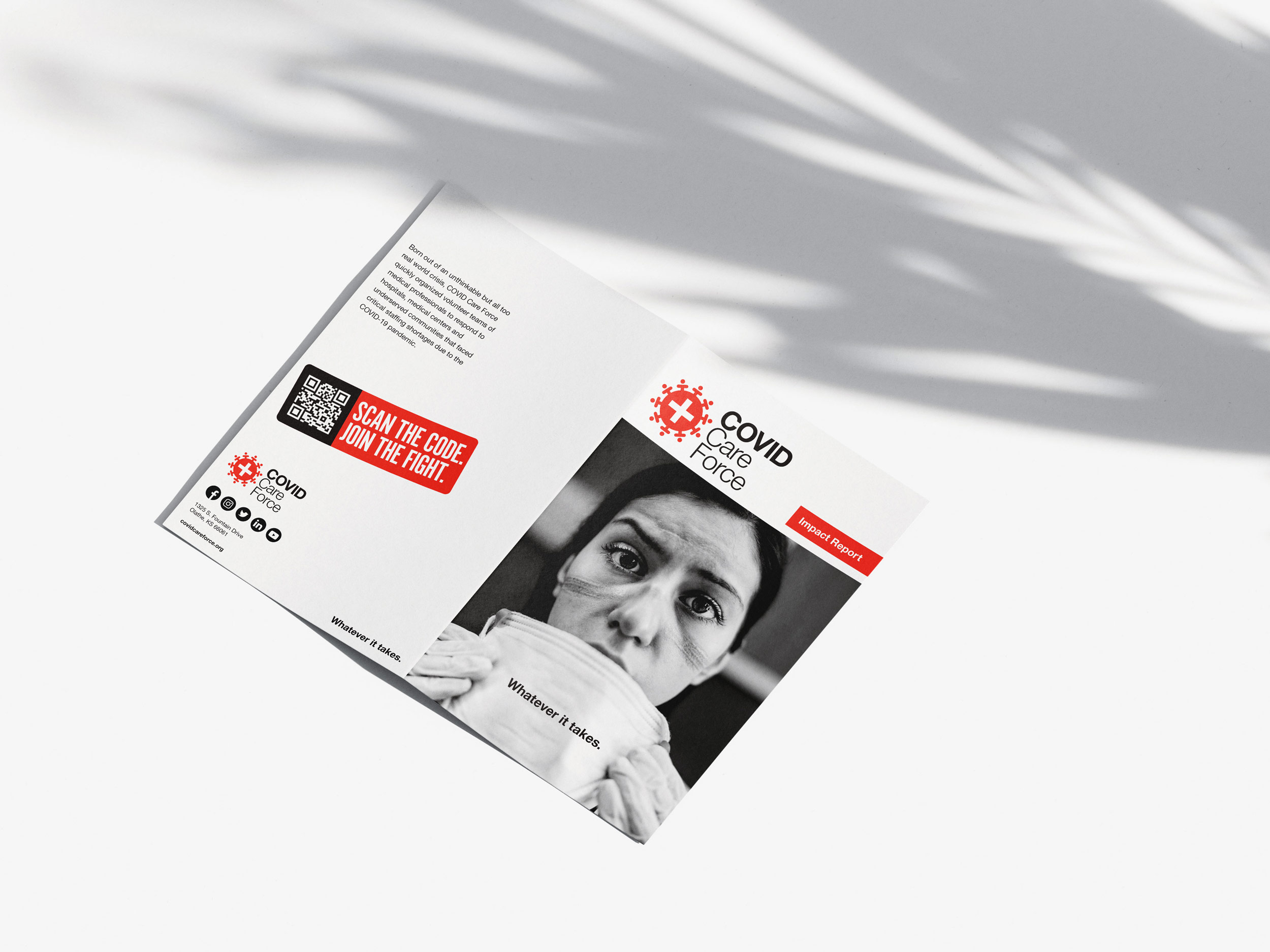
2020 Impact Report
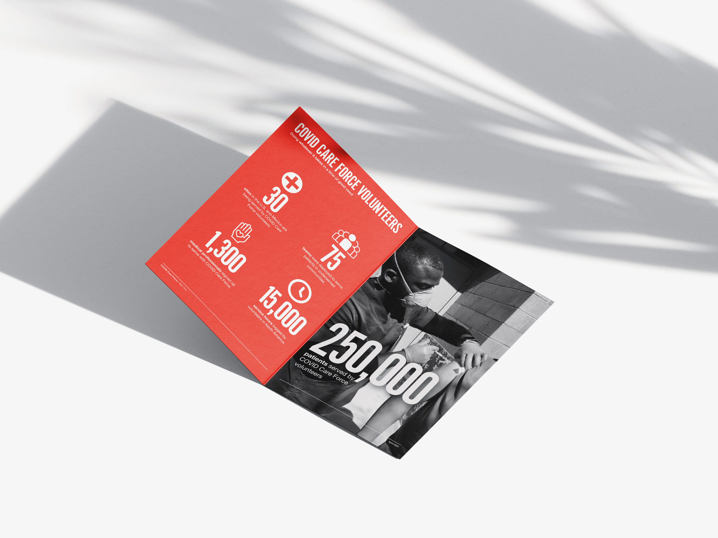
2020 Impact Report
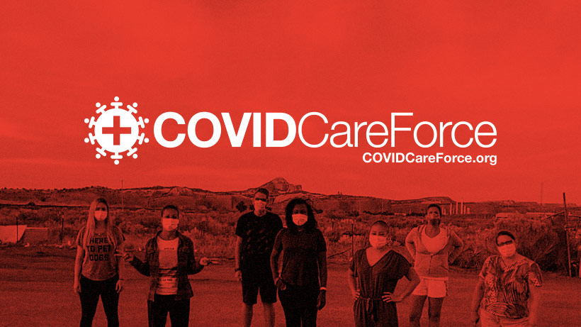
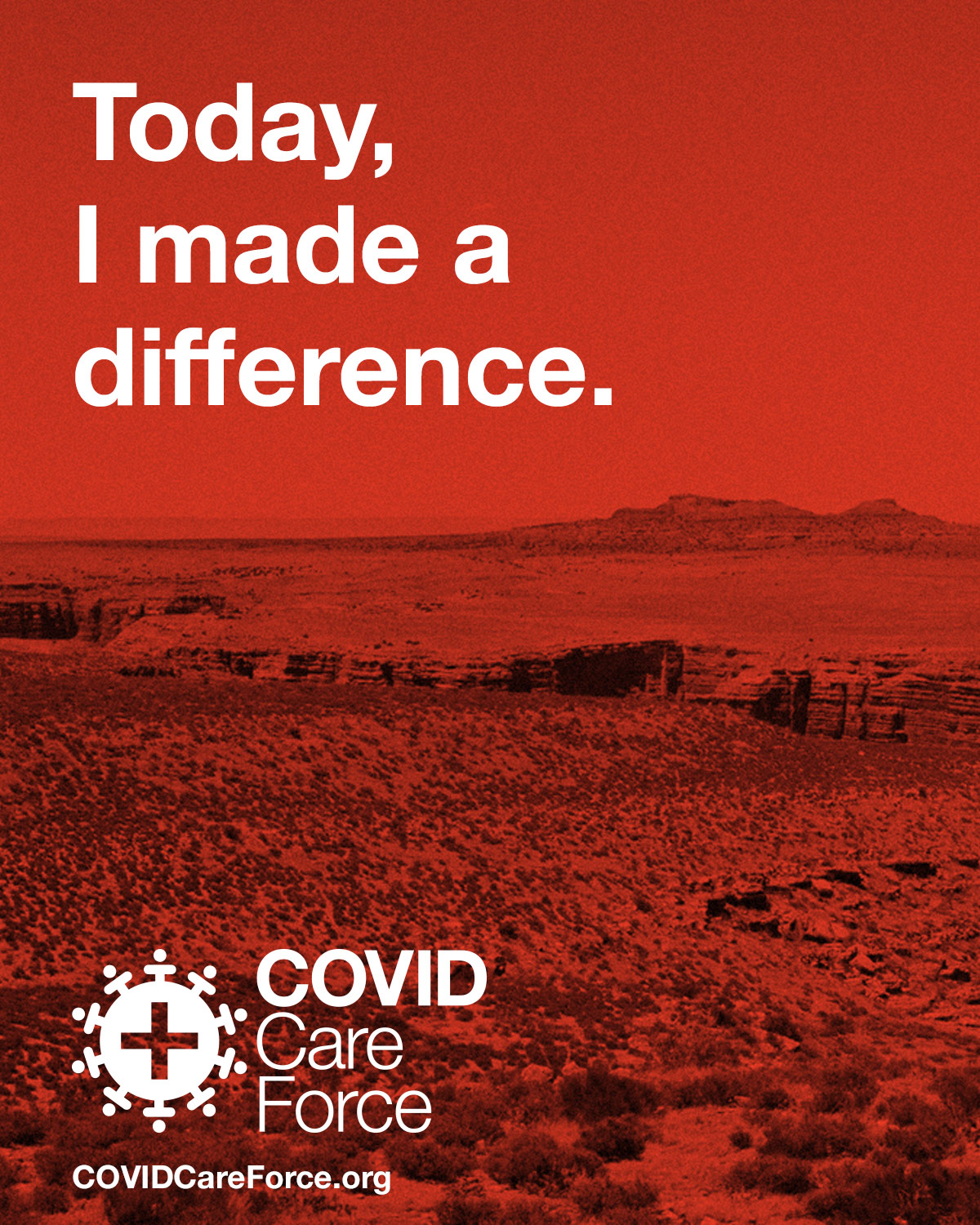
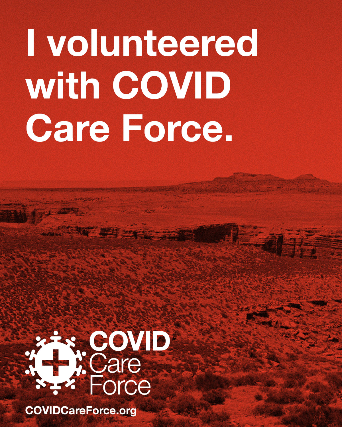
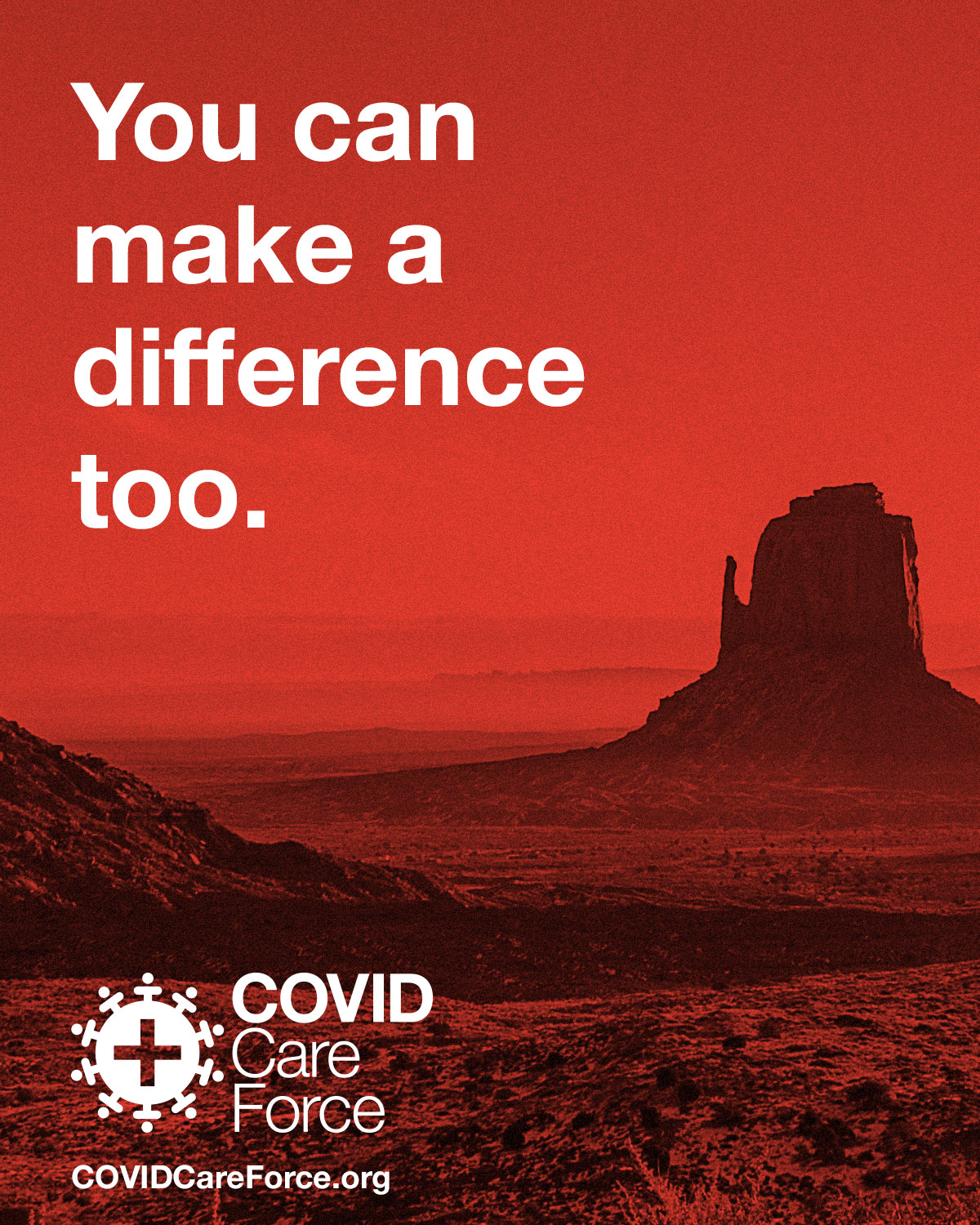
Sharable social media assets
Logo Exploration
The process began with a single directive: welcoming, not clinical. With the pandemic already generating enough anxiety, the brand needed to signal safety and humanity without flinching from the gravity of the moment. The systematic design thinking of Massimo Vignelli, particularly his non-profit work of the 1970s and 80s, provided the north star: refined simplicity as a form of credibility.


© Jeremy Burns 2026