Night Stories – Tour Posters
A tour isn't a series of events. It's a sustained visual atmosphere.
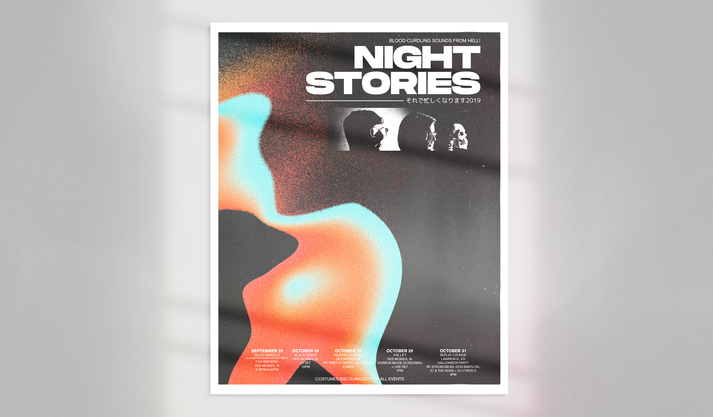
Night Stories perform only in October and on Friday the 13th. Their music is horror-themed and atmospheric, somewhere between a John Carpenter score and a Nine Inch Nails record. The poster needed to do what the music does: create a feeling before a single note is played.
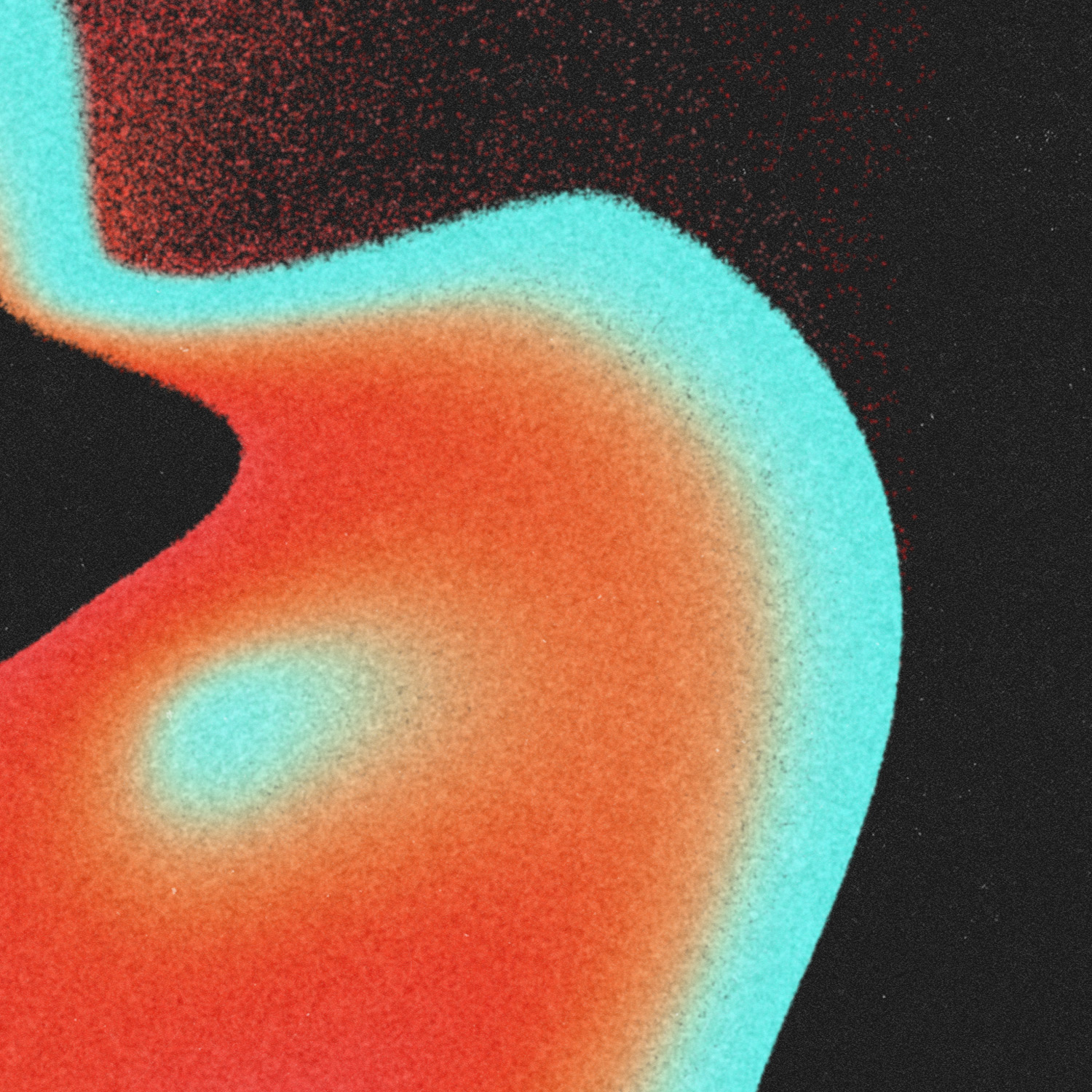
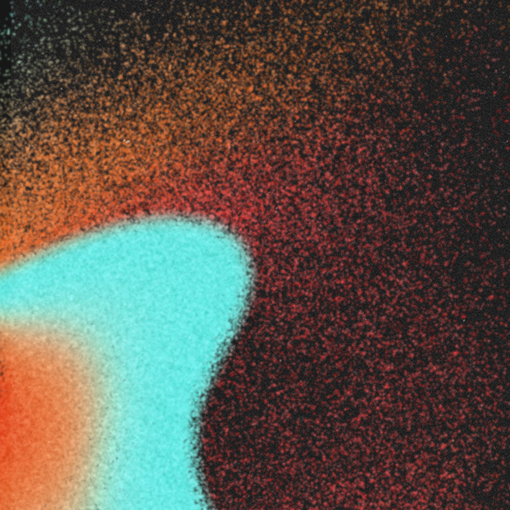
The large organic color forms, orange bleeding into teal against black, were created entirely digitally, but the influence was tactile. Italian horror of the 1970s used color as atmosphere rather than information: loose, fluid, biological. That quality was the target. Combined with the heavily grained band photograph and the weight of the condensed typography, the poster creates something that feels less like a concert announcement and more like a transmission from somewhere unsettling.
Client
Blood Gushing Records
Year
2019
Project Details
Creative Direction
Art Direction
Graphic Design

Variant Posters
Label Concepts
Label Concepts
Two variant posters were created alongside the main, one for each member, mirrored after one another. Stripped to black and white, they draw from the punk and hardcore poster tradition: high contrast, confrontational, built on the tension between figure and ground. Where the main poster creates dread through color and atmosphere, the variants create it through contrast and proximity.
Two variant posters were created alongside the main, one for each member, mirrored after one another. Stripped to black and white, they draw from the punk and hardcore poster tradition: high contrast, confrontational, built on the tension between figure and ground. Where the main poster creates dread through color and atmosphere, the variants create it through contrast and proximity. Same world, different register.
Two variant posters were created alongside the main, one for each member, mirrored after one another. Stripped to black and white, they draw from the punk and hardcore poster tradition: high contrast, confrontational, built on the tension between figure and ground. Where the main poster creates dread through color and atmosphere, the variants create it through contrast and proximity. Same world, different register.
Two variant posters were created alongside the main, one for each member, mirrored after one another. Stripped to black and white, they draw from the punk and hardcore poster tradition: high contrast, confrontational, built on the tension between figure and ground. Where the main poster creates dread through color and atmosphere, the variants create it through contrast and proximity. Same world, different register.
© Jeremy Burns 2026