Night Stories – Spooky Party Sounds From the Crypt Vol. 1
Atmosphere is a tactile requirement.
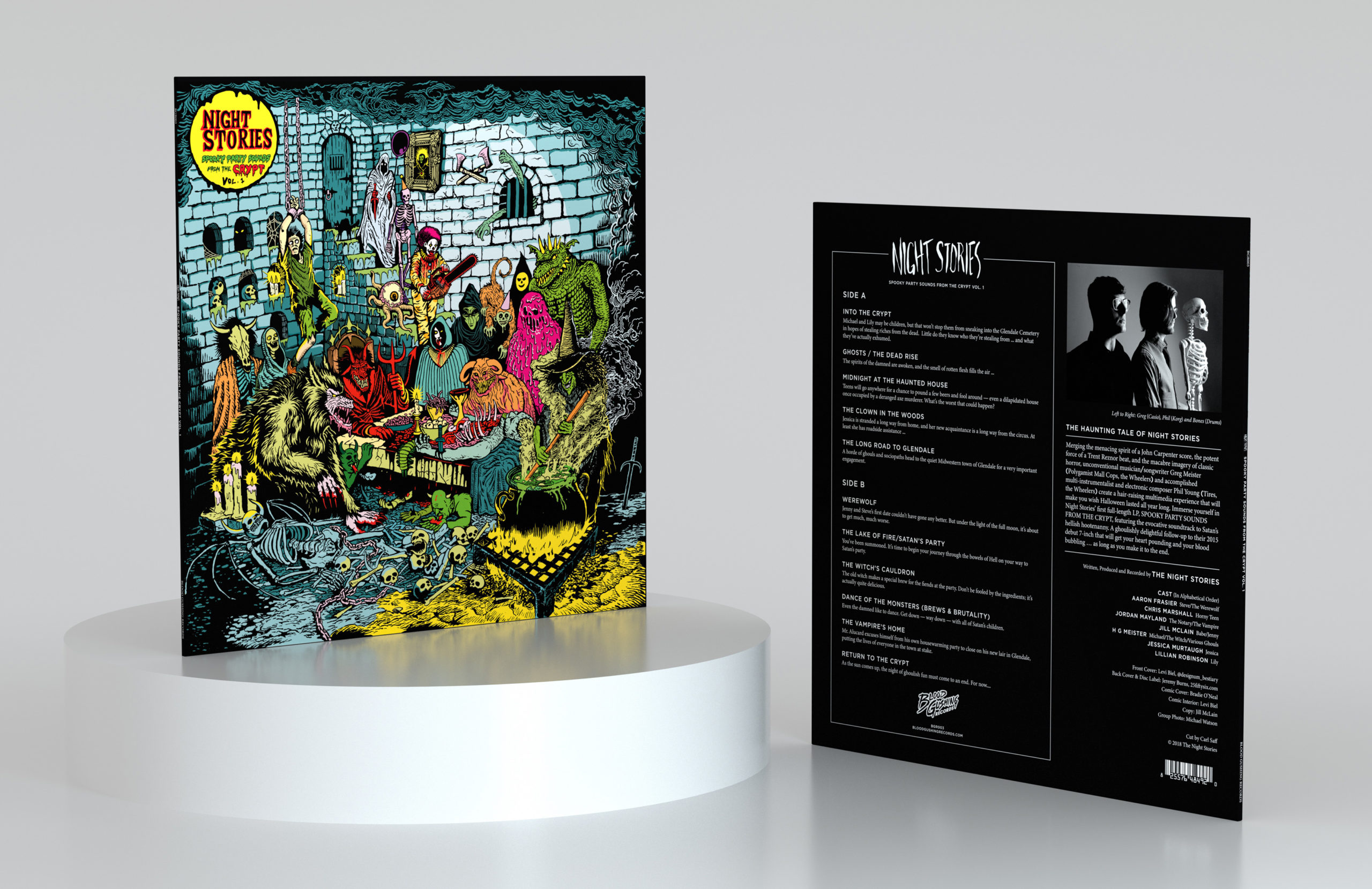
Night Stories' first full-length LP tells a single story: monsters travelling from across the horror world to attend Satan's Halloween party. The idea wasn't just to design a record sleeve. It was to build the world that the record lived in. The design looked to the pre-Comics Code Authority horror comics of the 1950s, lurid, expressive, uncensored.
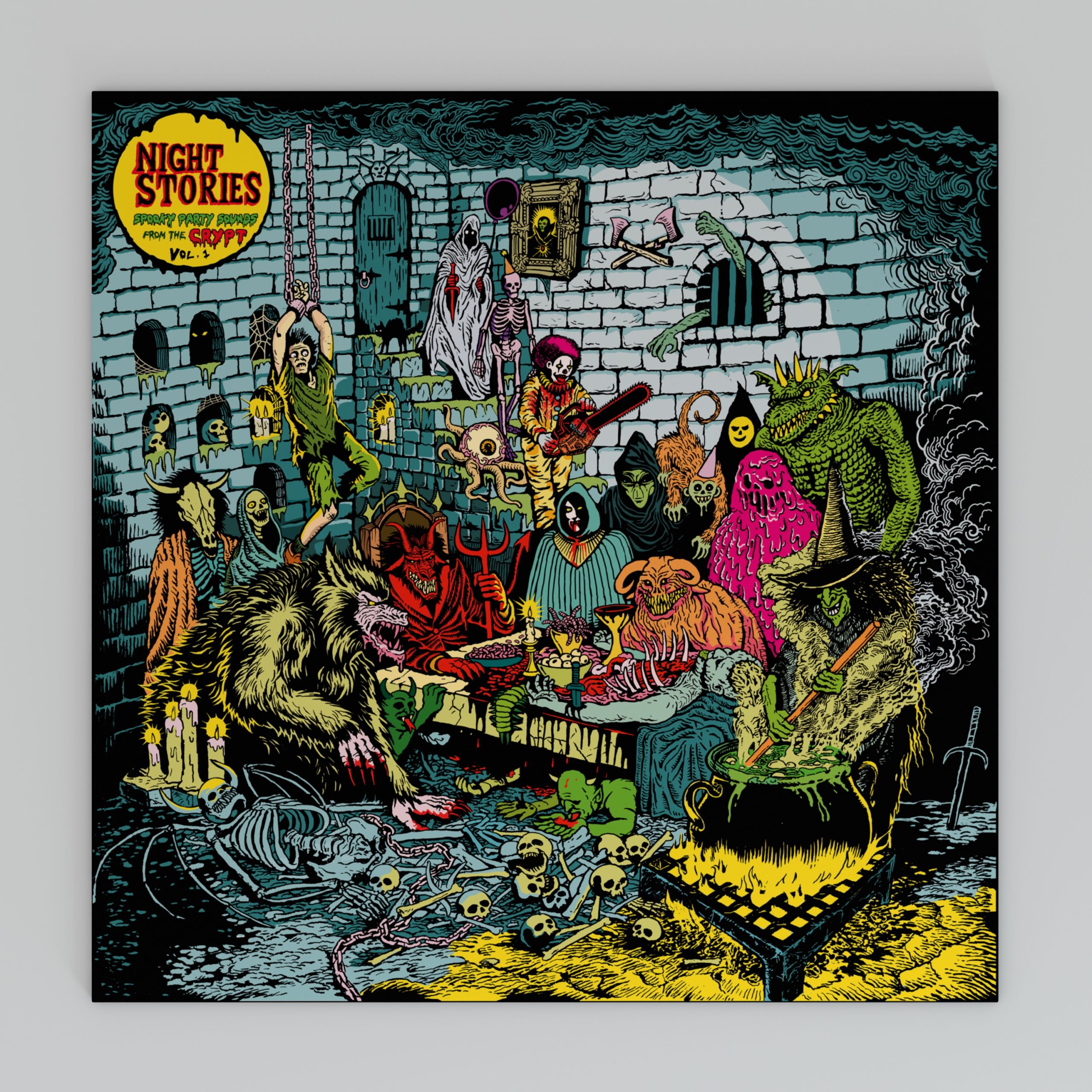
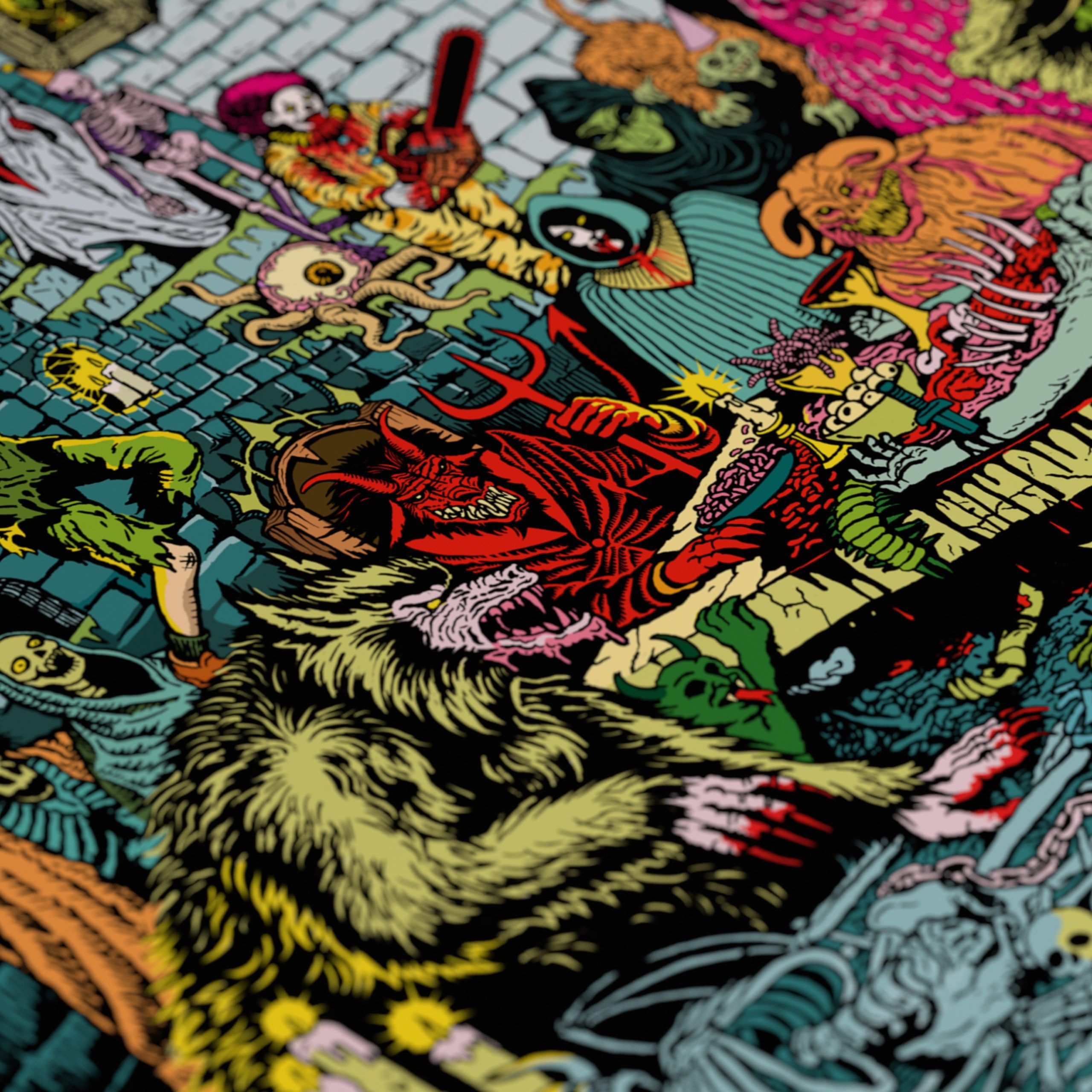
Levi Biel's front cover illustration is the visual culmination of the record's entire narrative. Every horror figure crowded into a single frame, skeletons, demons, monsters, a chainsaw clown, rendered in the bold outlines and lurid colors of the era. Dense, chaotic, and completely committed. The cover doesn't invite you into the record's world. It drops you into the middle of it.
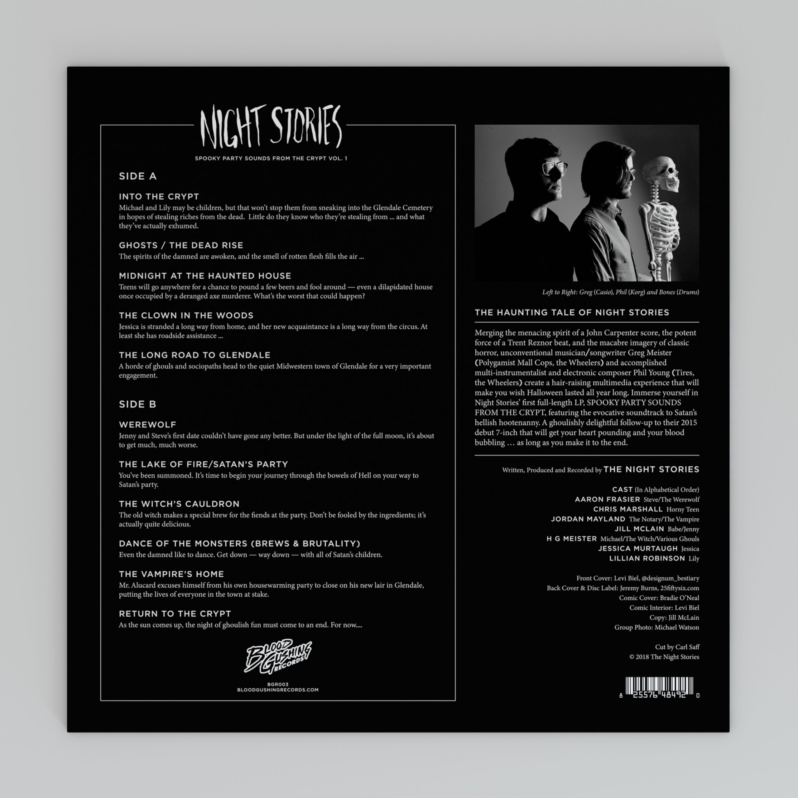
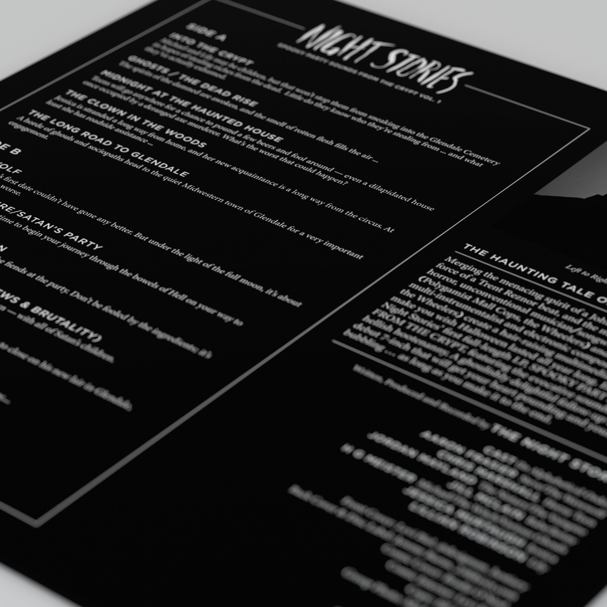
The back cover is where the design system reveals itself. Each track carries its own story synopsis, a setup, a scenario, an implied fate. That's not a record convention. It's a horror comics convention, translated directly onto the sleeve. Where the front cover is dense and chaotic, the back is clean, typographic, and precise. The contrast is deliberate. Two different visual registers, one cohesive world.
Client
Blood Gushing Records
Year
2019
Credits
Levi Biel – Illustrator
Jill McClain – Copy
Michael Watson – Photography
Project Details
Art Direction
Graphic Design
Logo Design
Front Cover
Back Cover
Cover Detail
Back Cover Detail
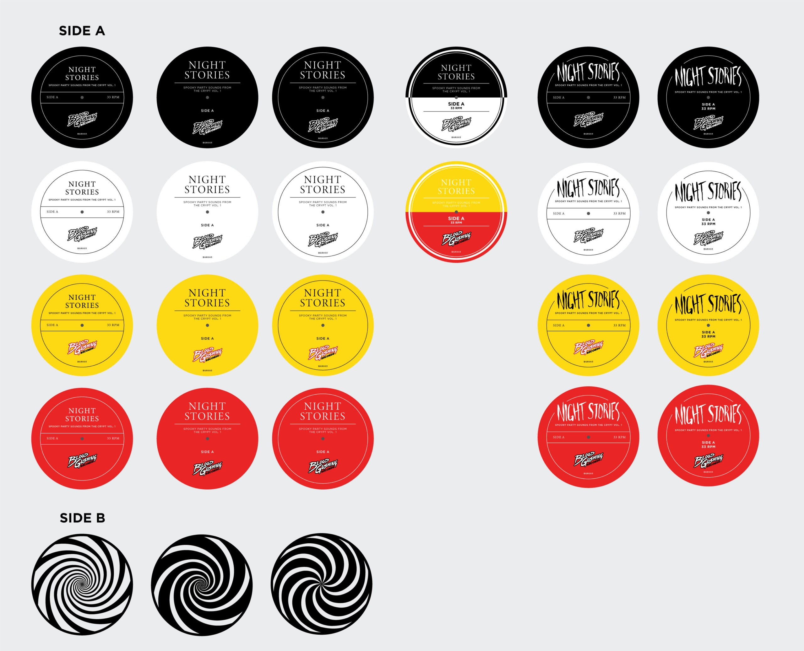
Label Concepts
Label Concepts
Label Concepts
The label design extended the system onto the vinyl itself. Side A carries the hand-lettered Night Stories logo on black. Consistent with the back cover's restraint, the design language carried through to the last detail. Side B is a hypnotic spiral. A deliberate choice. Not decorative, but conceptual. The kind of image that belongs in the horror comics world as naturally as anything on the front cover. Every surface considered. Nothing left to chance.
The label design follows closely to the back cover. It carries over the nostalgic horror and American record label designs from the 1950s. A multitude of designs were created to try and encapsulate the design language we were trying to achieve.
The label design follows closely to the back cover. It carries over the nostalgic horror and American record label designs from the 1950s. A multitude of designs were created to try and encapsulate the design language we were trying to achieve.
The label design follows closely to the back cover. It carries over the nostalgic horror and American record label designs from the 1950s. A multitude of designs were created to try and encapsulate the design language we were trying to achieve.
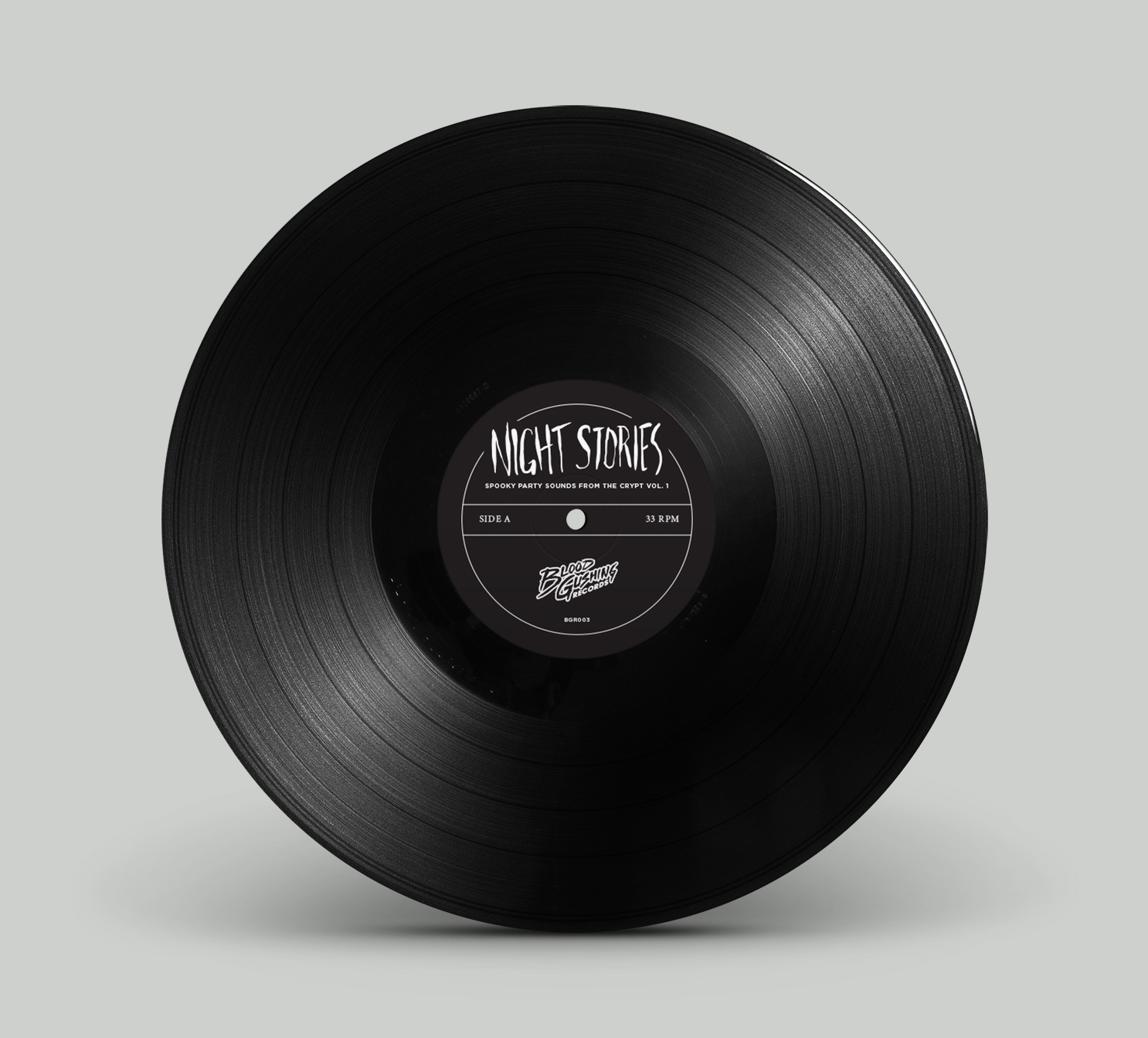
Final Label Design
Logo Design
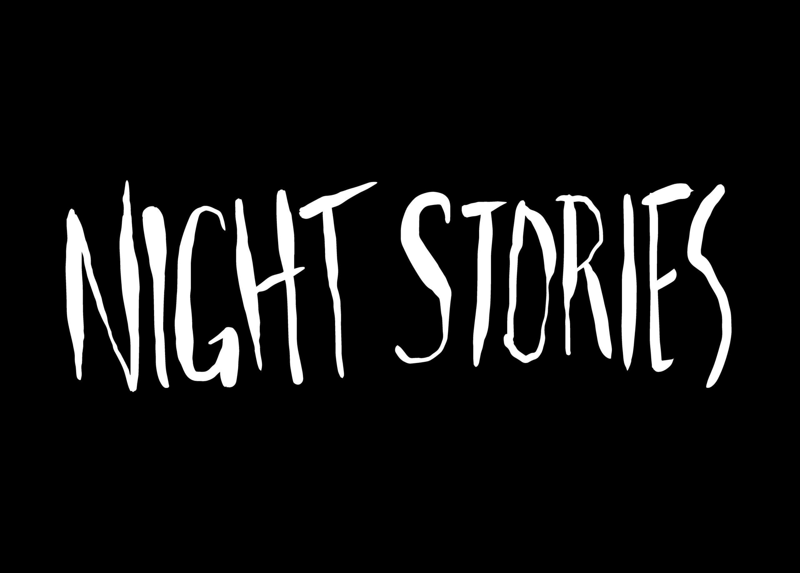
The Night Stories logo was designed for this release and became the band's primary mark, used on merch, on stage, and across every subsequent release. Hand-lettered and slightly irregular, it carries the same visual DNA as the illustration and the era that inspired it. A logo that felt like it had always existed.
© Jeremy Burns 2026