Blood Gushing Records
Horror is a philosophy
Blood Gushing Records was founded by two Des Moines musicians with a shared obsession: horror. Naturally, the label only releases on Friday the 13th or in October. That's not a marketing decision. That's a philosophy. And the design had to match it.
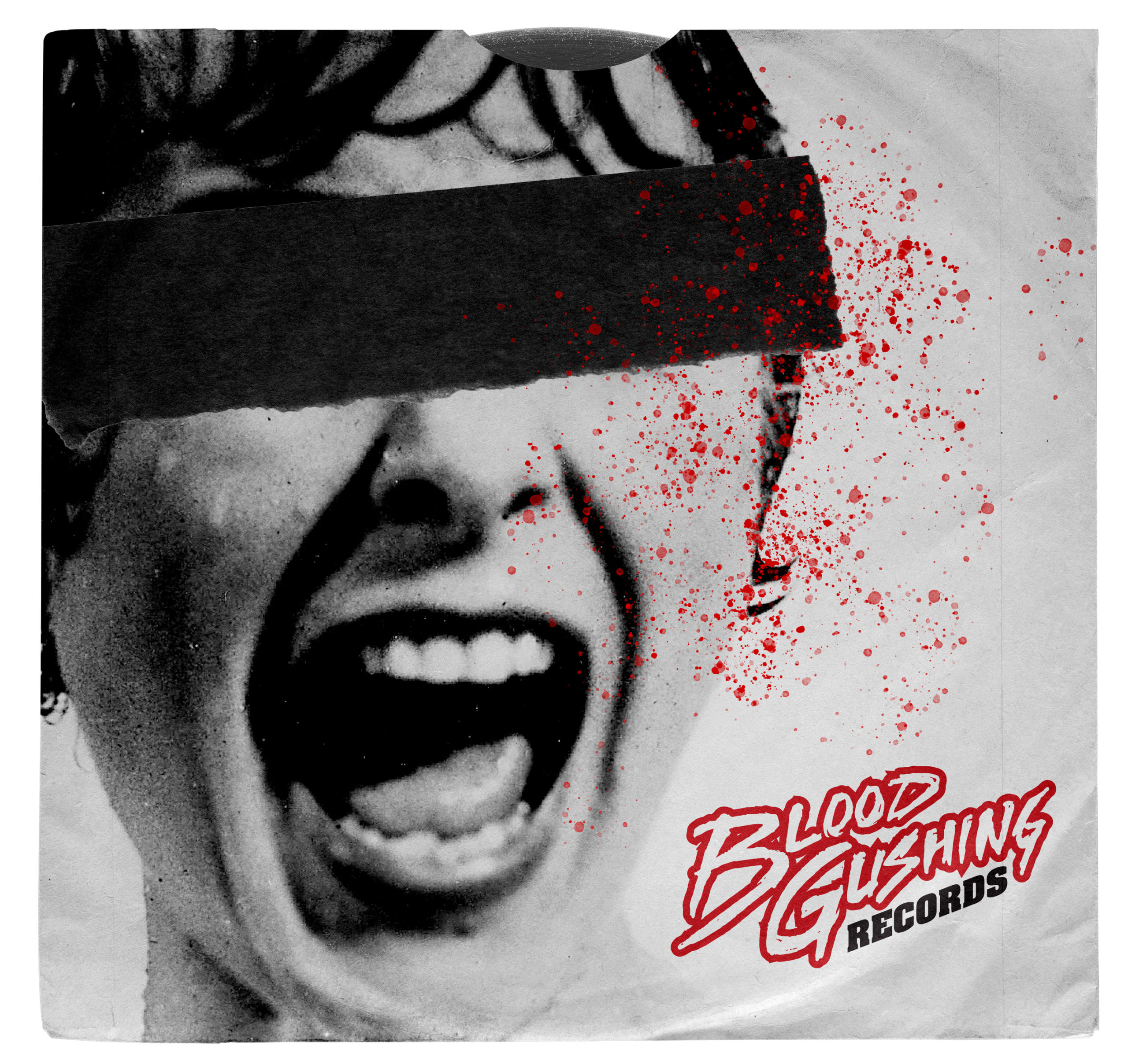
The visual north star was the 1980s VHS era. Not as a trend, but as a genuine reference. Greg and Phil were kids who grew up in video stores. To them, the horror covers of that era had a specific visual language: garish, urgent, slightly dangerous. The logo needed to live in that world but stand on its own.
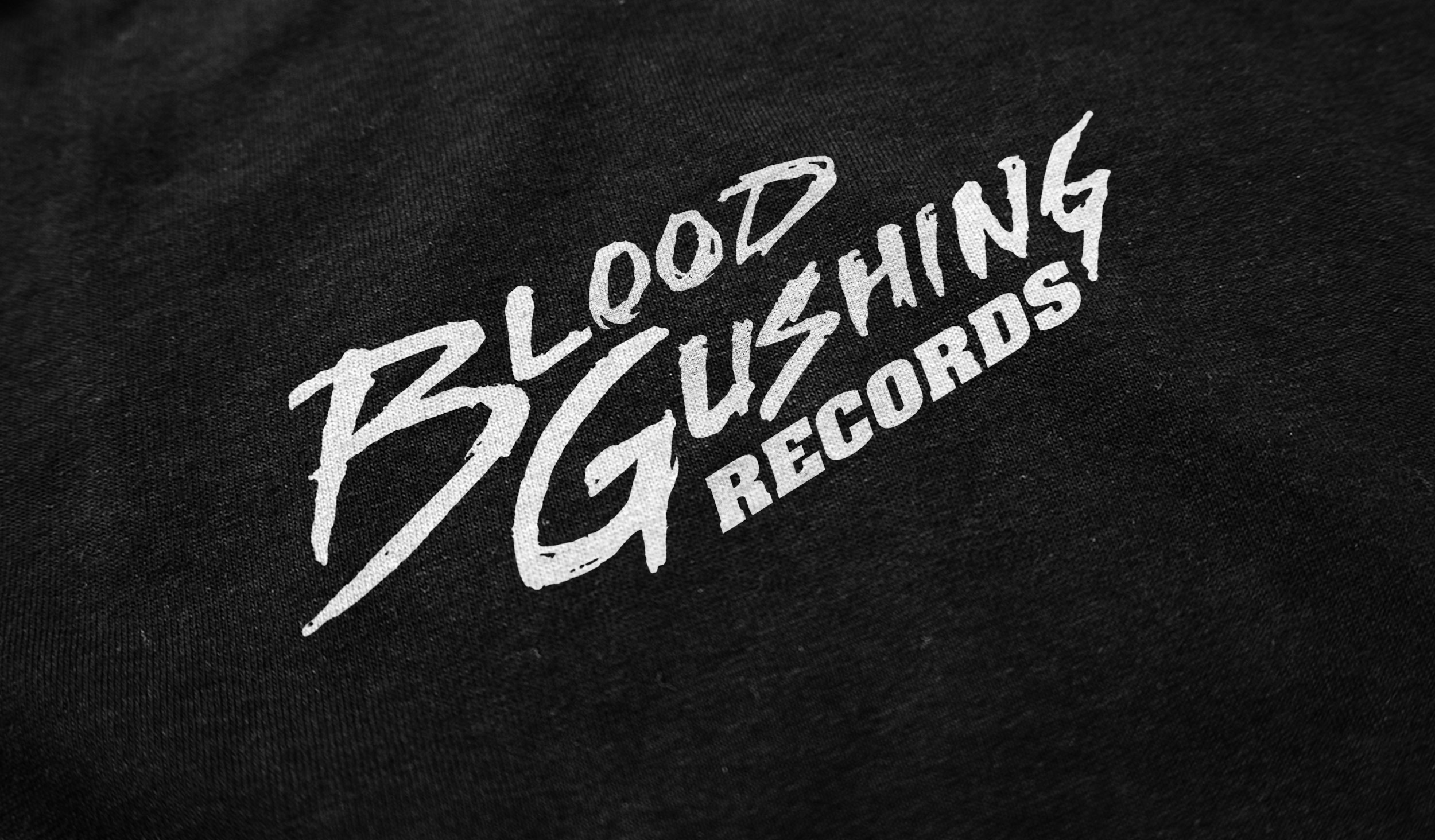
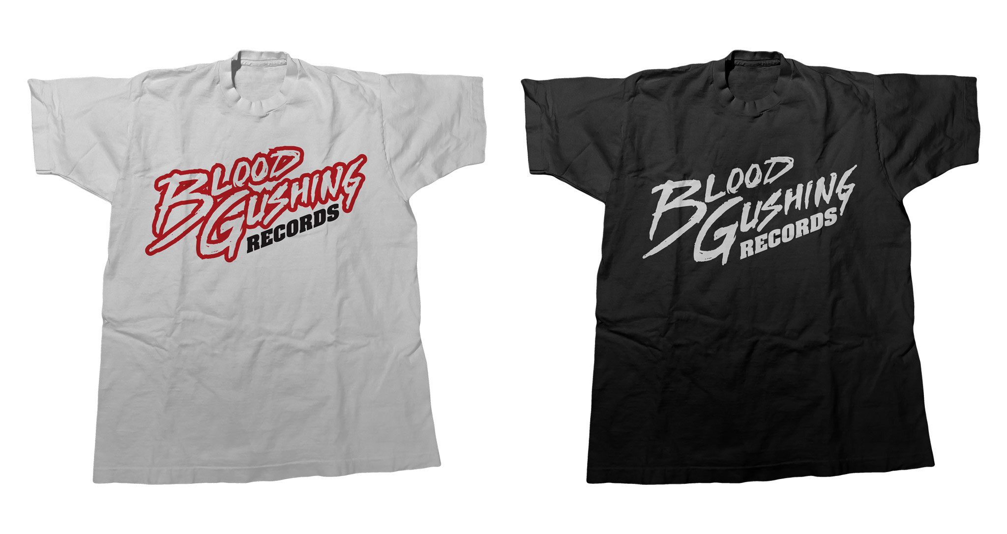
I pushed for the mark to be hand-drawn, because a label this committed to its philosophy deserved a mark that was too. Jagged and thorny, textured in a way that feels like something sharp passed through it long ago. The result is a mark that doesn't look designed so much as it looks discovered. As if found in an obscure horror collection. Two colorways gave the brand flexibility without diluting the identity. Both work independently. Together, they cover every surface the label would ever need.
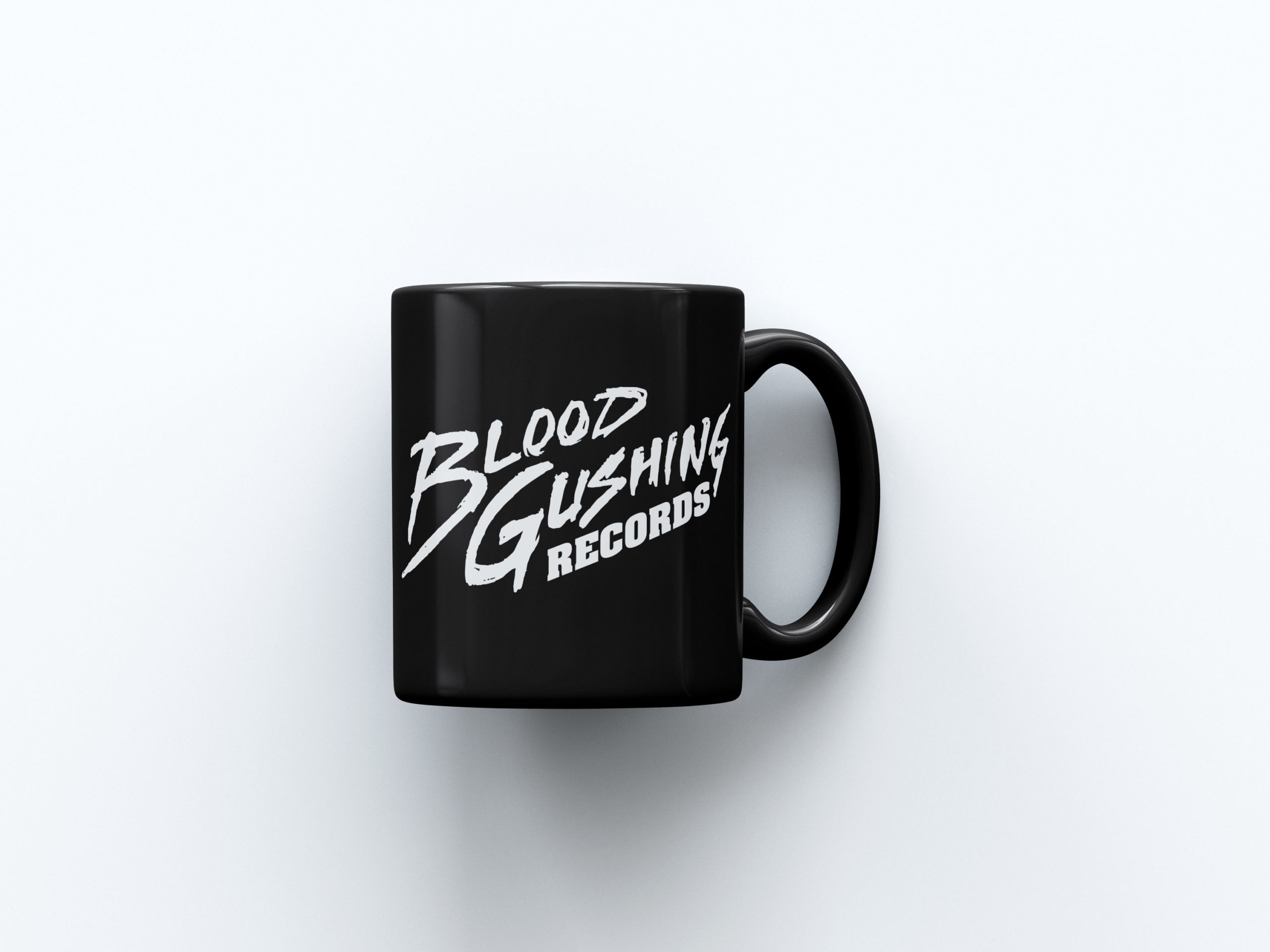
The initial package was complete from day one: t-shirts, a coffee mug, and a 7-inch sampler, all carrying the mark into the physical world. For a label built on the tactile nostalgia of vinyl and VHS, the format choices weren't incidental. They were the point. Blood Gushing Records wasn't just a name on a website. It was something you could hold.
Client
Blood Gushing Records
Year
2018
Project Details
Creative Direction
Art Direction
Logo Design
Graphic Design
Website Design
T-Shirt Designs
Coffee Mug Design
7-inch Sampler
© Jeremy Burns 2026