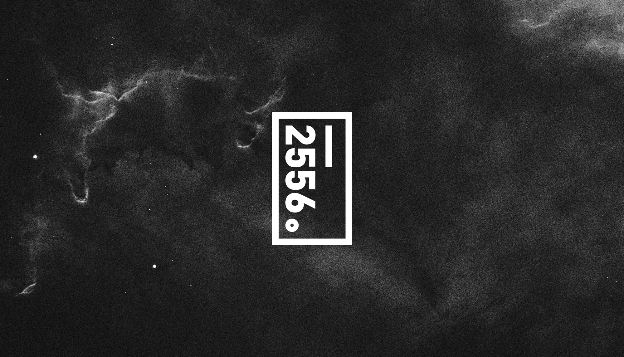
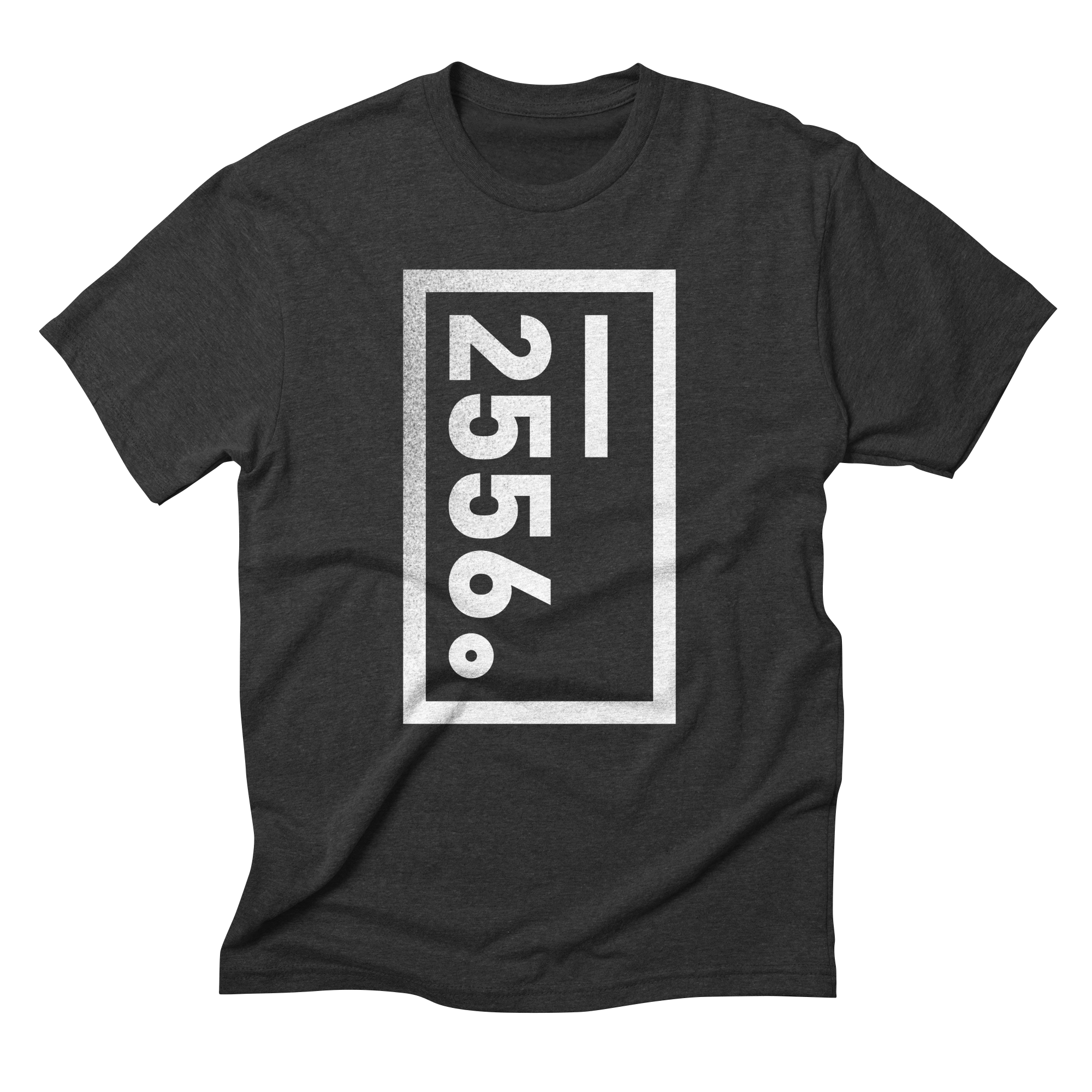
2556
The brand is the architecture, not the art.
Every design practice needs a name. This one came from a specific place, an address, a moment, a decision that didn't need explaining. The challenge was building a mark as deliberate and as mysterious as the number itself.
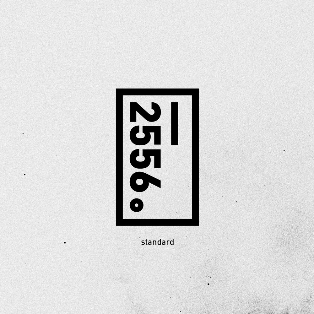
The mark is built on restraint. A rectangle. Stacked numerals. A vertical line for balance. And a period. Not as punctuation, but as a declaration. The brutalist sensibility was instinctual, not trend-driven. Every element earns its place, or it doesn't exist.
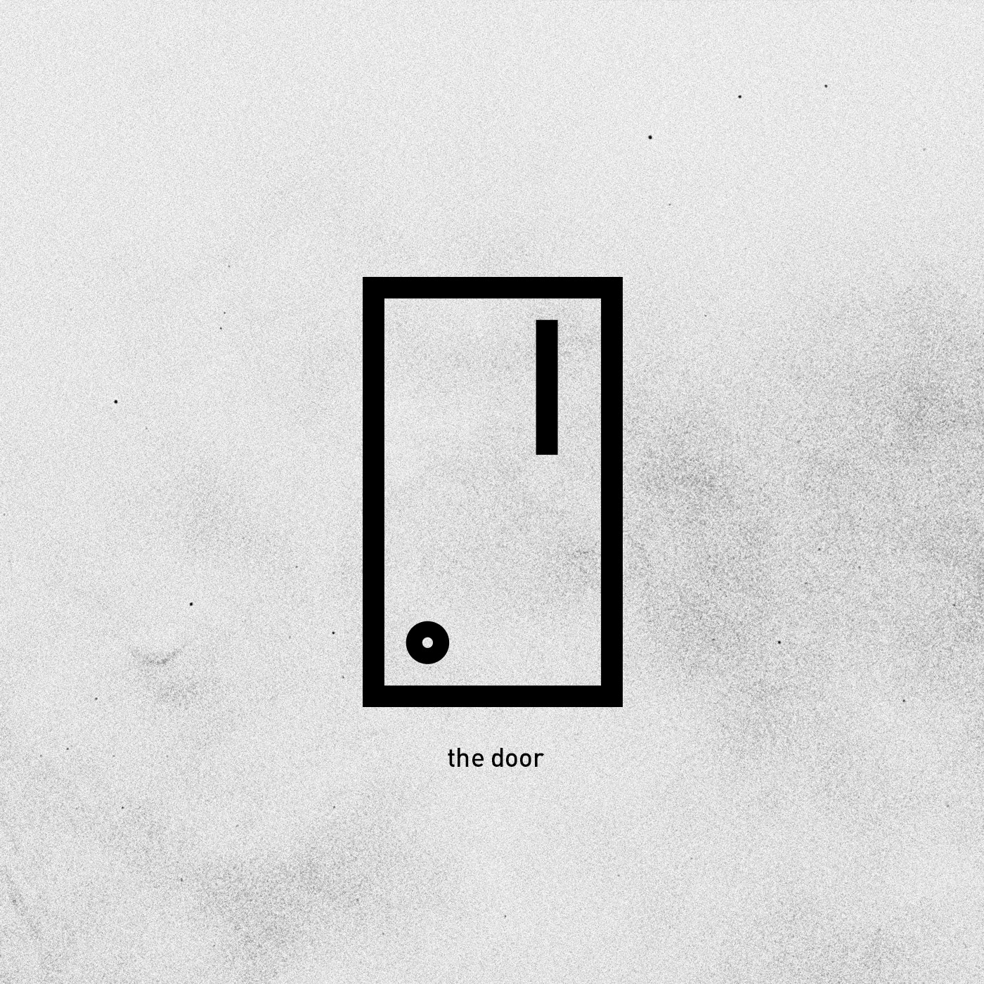
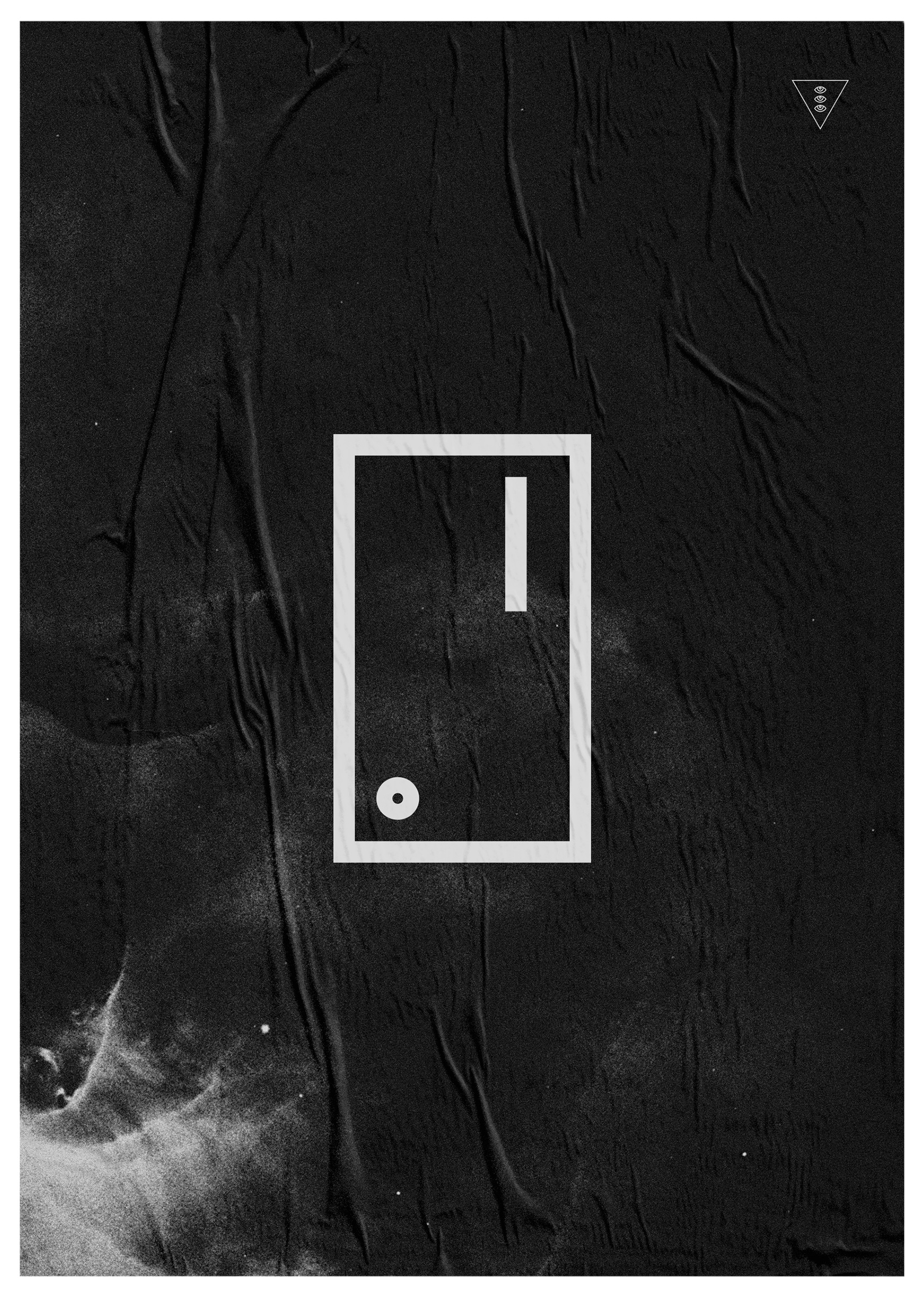
The door emerged through the process. The house number became the threshold. The mark contained its own biography without announcing it. Used selectively on its own, in moments where mystery can breathe, the door version functions as an invitation rather than an announcement. Two marks, two registers. One announces. One opens.
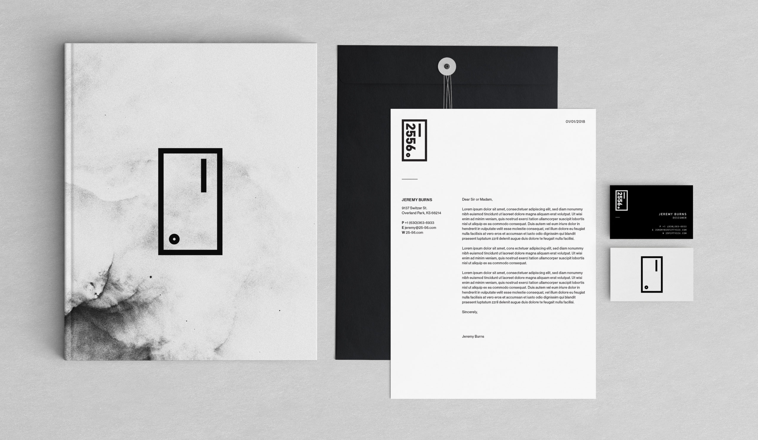
The identity extends into a complete stationery system: letterhead, business card, envelope, and a notebook. The standard mark anchors the professional touchpoints. The door appears where it can carry its full weight, the notebook cover, and business card. Not everything was planned, but everything was intentional.
Client
Self
Year
2018
Project Details
Branding
Creative Direction
Art Direction
Identity Design
Graphic Design
Website Design
© Jeremy Burns 2026